Bill & Tip
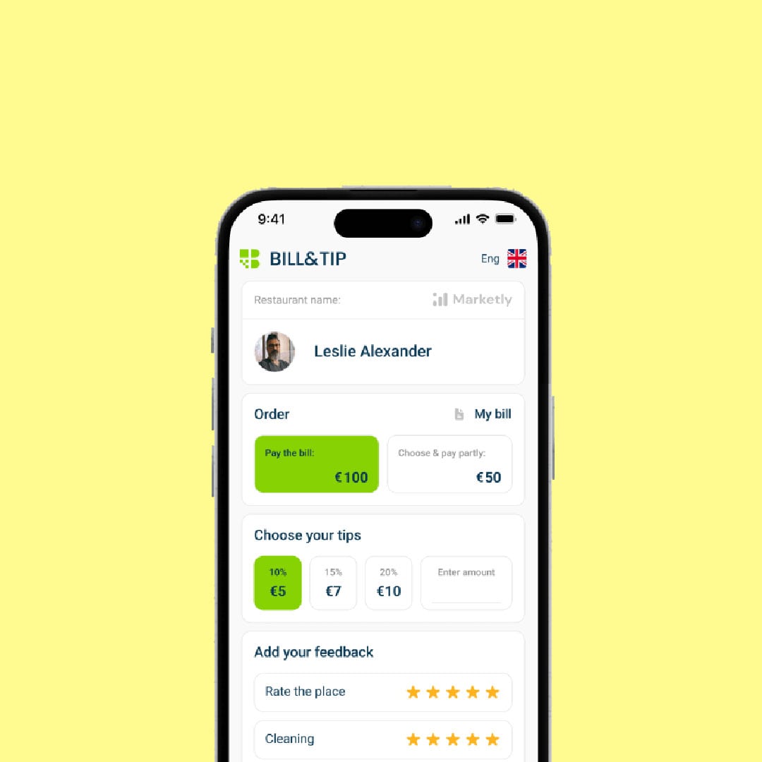
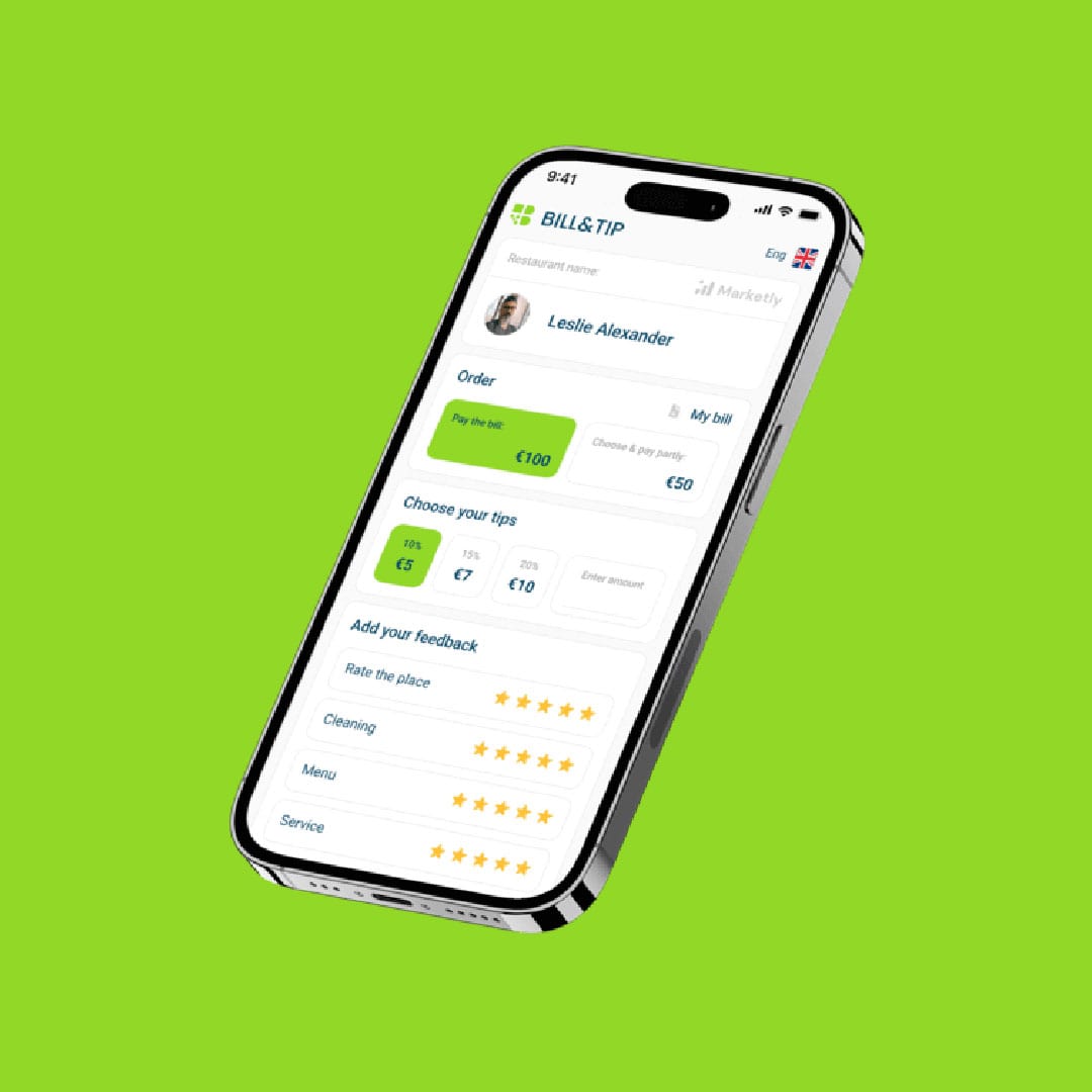
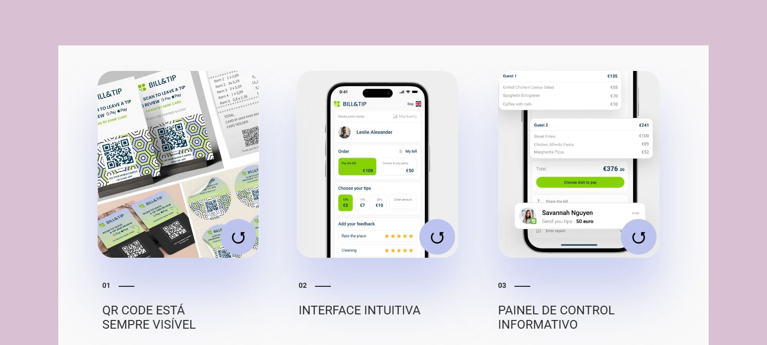
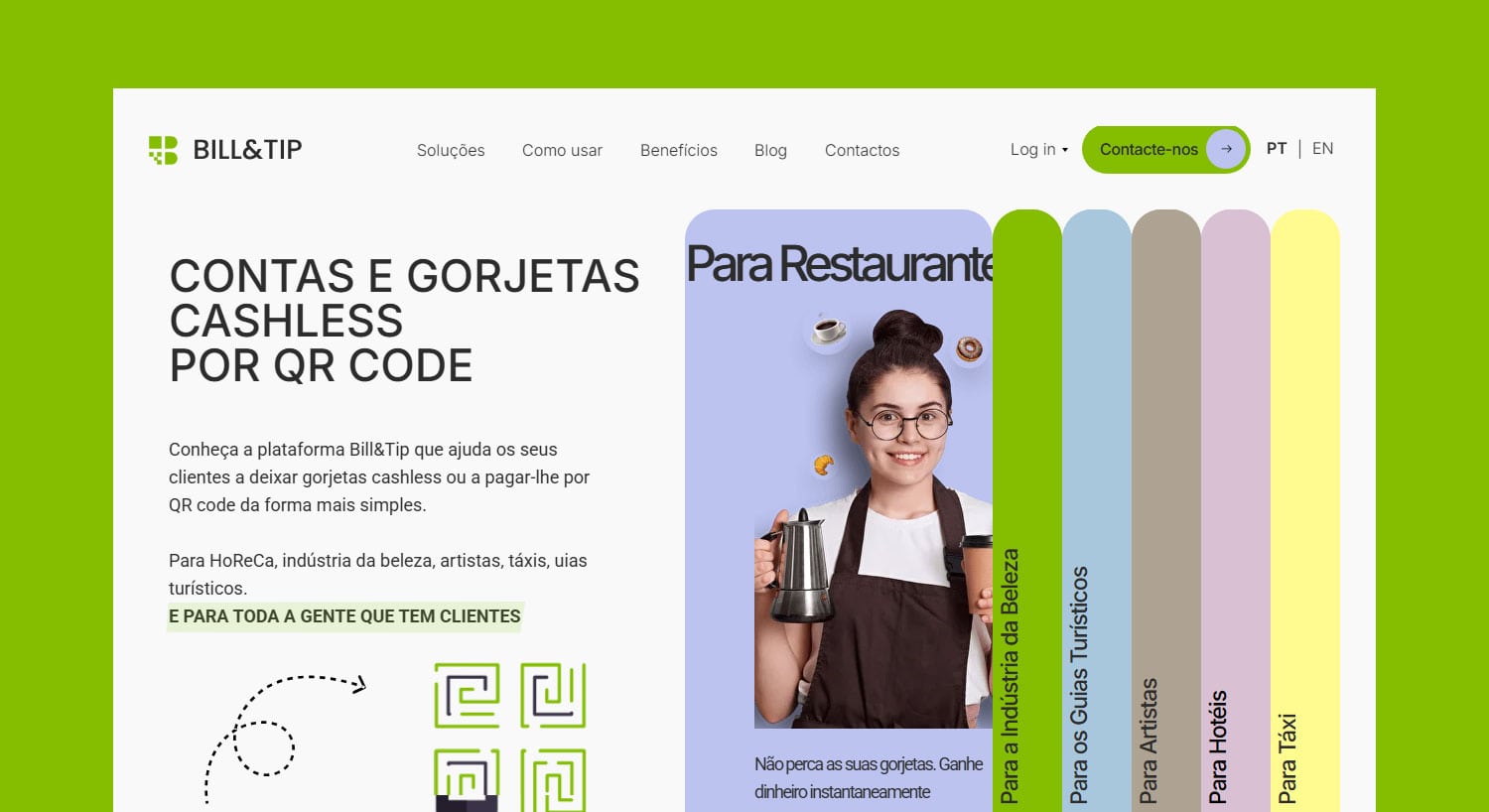
Bill & Tip (also registered as BillandTip and BillnTip), based in Portugal, is a modern cashless payment platform designed for service-based businesses such as hospitality, restaurants, beauty, taxis, and tourism. Using QR codes, it allows customers to settle bills and leave tips in one seamless interaction without the hassle of physical cash or app registration. The platform is free to use, secure, and simple for both businesses and customers.
Brand Naming x Due Diligence
Summary
Naming a payment app is no small feat. The name must communicate trust, security, and clarity in an instant while staying simple and memorable enough for everyday use. For this project, we focused on finding a brand name that was not only descriptive and easy to understand but also available across trademarks, domains, app stores, and social handles. The result was Bill & Tip, a name that feels effortless, fits the industry vocabulary perfectly, and gives the app the credibility it needs to win user confidence. Read the case study to see how we got there.
Full Case Study
The Problem
When the founders set out to launch their cashless payment platform in Portugal, they knew the stakes were high. In a crowded and competitive fintech market, the wrong brand name could confuse users or erode trust before they even tried the app. They needed a name that represented the app’s offerings clearly, felt instantly understandable and engaging, and passed all due diligence: trademark availability, matching domains and social media handles, and a smooth registration on both the Play Store and App Store. This wasn’t just a creative exercise; it was a legal, strategic, and technical challenge with multiple moving parts.
The Strategy
Alright then, challenge accepted! We kicked off with an in-depth research into the market, competitors, and target audience. In the service industry, clarity is everything: if users don’t immediately understand what the app does, they probably won’t download it, let alone use it to pay. As this was a very targeted app, we explored common vocabulary in the HoReCa (Hotels, Restaurants, Cafés) and broader service industry, using these as building blocks for the brand names. The idea being that industry-specific vocabulary would feel natural, intuitive, and instantly recognizable to the audience.
We shortlisted the strongest candidates and tested the two finalists through surveys. Throughout, we collaborated closely with the client, sharing our research findings and guiding them on the true role of a brand name.
Nb: We explore multiple naming strategies for each naming project. This case study only shows the strategy behind the final name chosen by the client.
The Solution / Result
The chosen name, Bill & Tip, is simple, descriptive, and instantly communicates the app’s purpose. It speaks the everyday language of the service industry, making it memorable, easy to pronounce, and easy to spell. Bill & Tip passed all due diligence, and we secured variations (Bill n Tip and Bill and Tip) to strengthen the brand’s protection. The result is a user-friendly identity that gives the app instant credibility and a confident foundation for growth.
Another contender we explored was Tab & Tip (playing on the catchy “double T”), but in the end, the direct clarity of Bill & Tip won out.
Fun Fact: After just two naming rounds and the survey, the client chose Bill & Tip, which was actually suggested in round 1… proof that the strongest ideas often rise to the top ;).
Brand Info
www.billntip.com
www.billandtip.com
*Visual identity & web design by Studio351 Portugal.
*Images from Bill&Tip.
© Bill&Tip
